Erez Marom Photography
Article: Behind the Shot - Lost in Space
Posted on 7th September, 2014 - Back to Blog Listings
In this article I'll take you to the Snæfellsnes peninsula in western Iceland, to talk about an image I'm very happy about. It wasn't easy getting the shot to look as it does now, but I think the outcome justifies all the hard work, and I hope you'll agree.
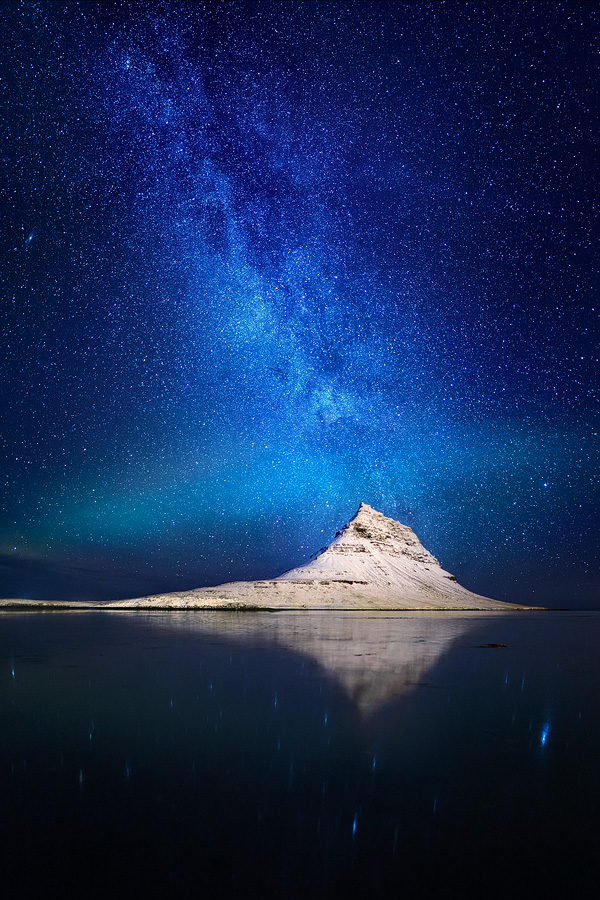
This picture was taken on my second visit to Kirkjufell ('Church Mountain' in Icelandic, also called 'Pyramid Mountain' for obvious reasons. The mountain is conveniently situated right outside the town of Grundarfjörður, in the north central part of Snæfellsnes). I was there back in December 2011 when I experienced some harsh weather, so I came back with a vengeance to get some better shots and to scout additional locations for my 'Winter Paradise' photo workshop.
This visit was by far more fruitful. We had several consecutive cloudless nights, and two Aurora shows in just four days! On one of the beautiful clear nights I went to shoot the mountain reflecting in the lake beside it. It was a moonless night, and the all-but-nonexistent light pollution made it possible to see an uncountable number of stars, and of course, the milky way, which was beautifully positioned right above the mountain. To add to this, the mountain was lit to exactly the right amount by the faint road lights, and a hint of Aurora was also visible. Talk about a perfect starting point!
Equipment and Setup
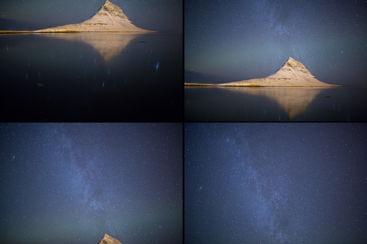
It doesn't look like it, but this image is a vertical panorama composed of four separate exposures taken in landscape format. I used my Canon EOS 5D mark III and a Samyang 24mm f/1.4 - a lens that I really like for night photography, as it's sharp even when wide open and lets in an incredible amount of light while still being wide enough for classical landscape photography. The finished panorama turned out to be over 40 megapixels, which is great for large-scale printing.
All four shots were 15 second exposures, at f/1.4, ISO 3200. This long exposure, high ISO setting is what does the magic when it comes to night photography, as can be seen by the amazing number of stars visible in the image.
Composition
The composition is quite straightforward here. The mountain and reflection are on the bottom third of the image, and the Milky way seems to pop out of the top of the mountain, intersected by the streak of Auroral light.
What I do want to mention is the special feel brought about thanks to the fact that there is no 'real' foreground, only a faint one made of star-reflections in the lake. I love shooting this way (I call this 'unforeground'), since it really emphasizes the spacey, floating properties of the different elements in the shot. It truly seems like the mountain is lost in space!
Post Processing
As mentioned, this is a vertical panorama. Let's look at the four images that make it up.
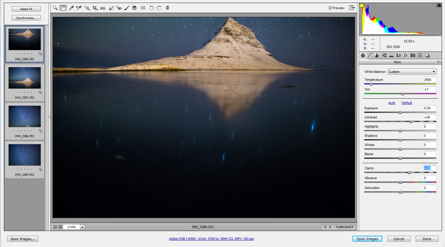
I opened the RAW files in Adobe Camera Raw, and performed some tweaks to the color temperature, contrast and clarity. I also tried to compensate for the heavy vignetting caused by the ultra-wide aperture setting.
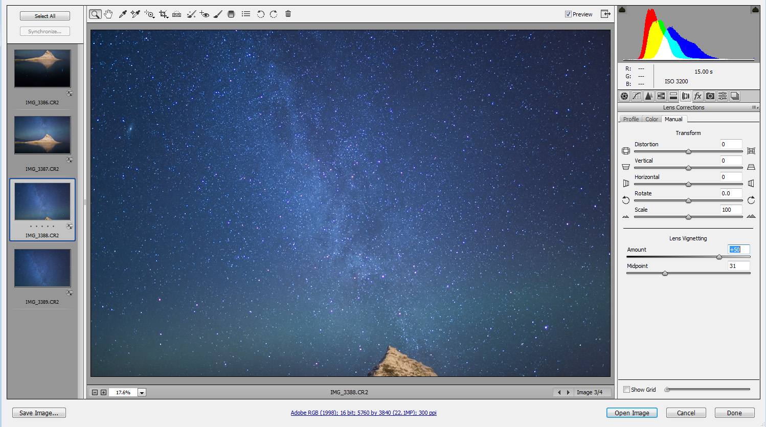
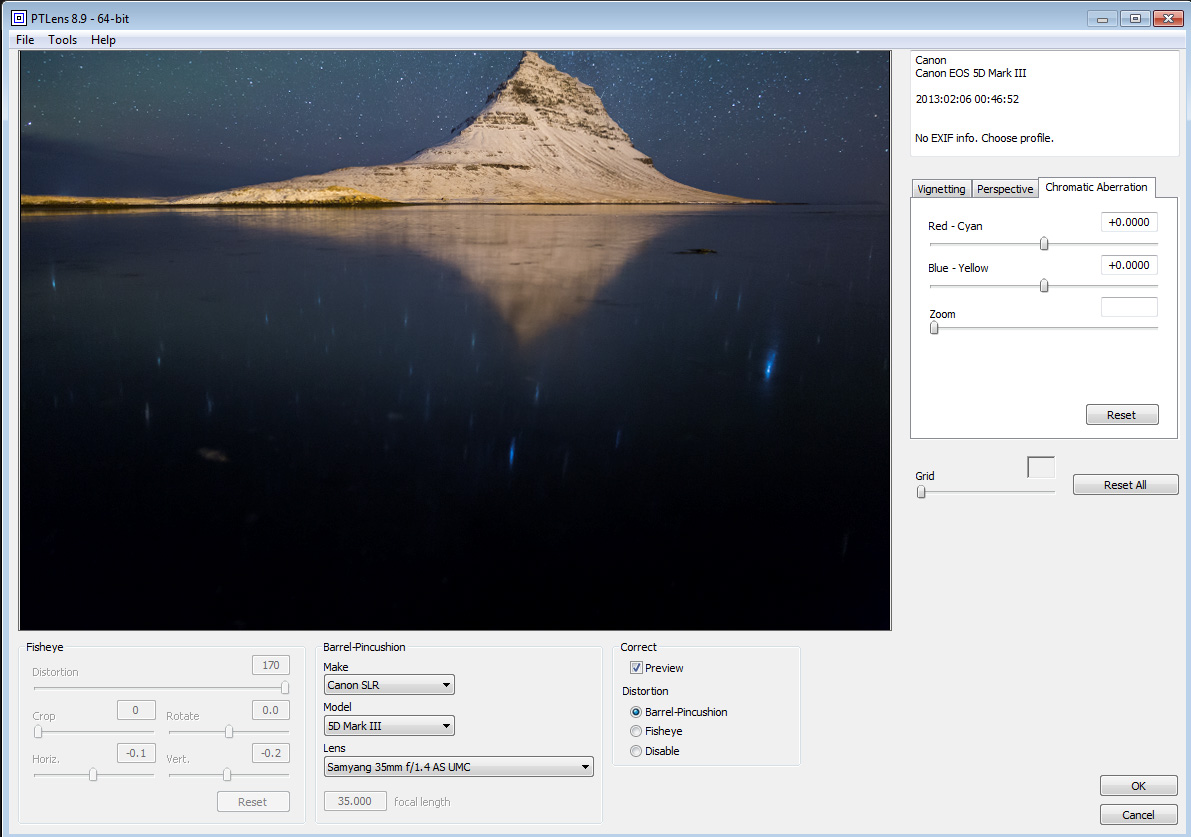
Next I saved the files as TIFFs, and went on to continue post-processing in Photoshop. First, I used PTLens, a nice Photoshop add-on, to correct the lens distortion in order to make the stitching easier. PTLens does not yet support the Samyang 24/1.4 lens, so I tried a few options until using the correction for the Samyang 35/1.4 - close enough, but additional correction will be performed and explained below. I applied the same correction for all four images.
Next, I went on to stitch the panorama. This proved much more difficult than I imagined. In the image below you can see what I got when trying Photoshop's automerge option with the shots. Oy vey!
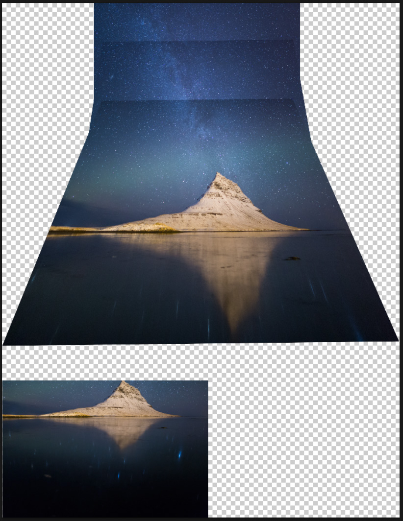
Photoshop couldn't even align the four shots together, not to mention the terrible distortion it produced. I therefore had to revert to manual stitching. I won't tire you with all the details of the stitching, as it was pretty hard and complex to achieve a natural-looking blend between all the shots. The easiest part to blend was the two lowermost shots.
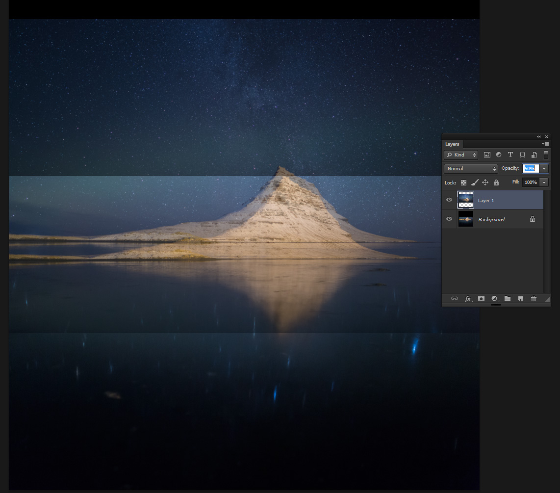
I layered the two images, turned down the opacity on the upper layer and moved it until it overlapped the bottom layer perfectly. I then deleted the part containing the mountain's reflection, and flattened the result. To continue the process, I added and gently blended the other two shots, until what I had looked like this:
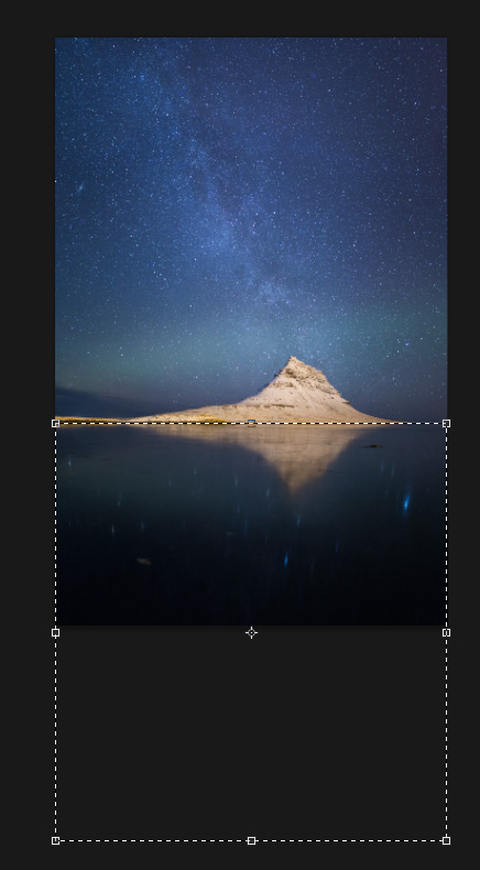
Ok, now I had the complete panorama. But the lens' distortion caused a slightly unrealistic look of the mountain. It looks a little 'flat' compared to reality, so I needed to correct that. I used Photoshop's free transform (Edit->Free Transform) option, and 'squished' the image a tiny bit until the mountain looked more like it actually does.
![]()
Another corrective step I did was to widen the reflections of the stars a bit, since they too got unrealistically 'squished'. I did that with the content-aware scale option (Edit->Content-Aware Scale), since it allowed me to stretch the star-reflection area without stretching the mountain's reflection, which would look unrealistic.
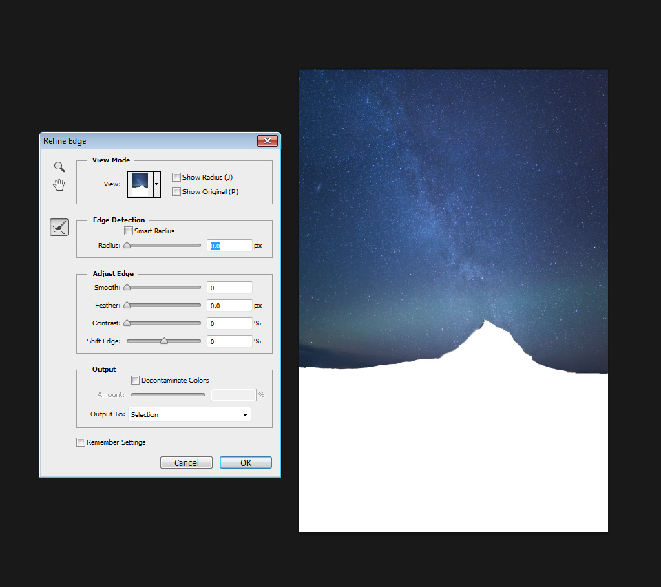
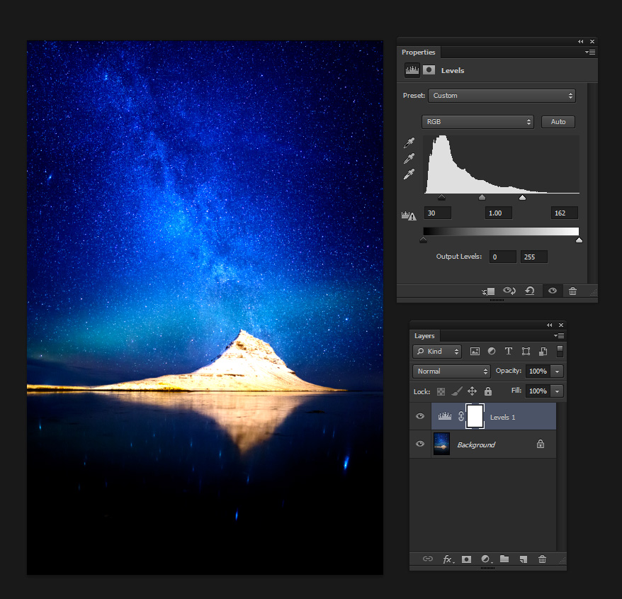
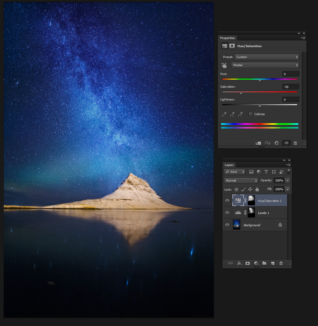
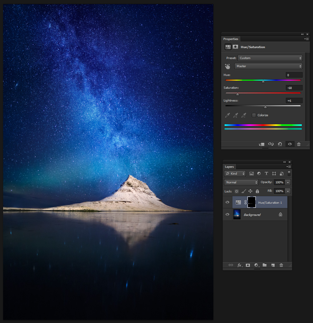
Ok, now the different elements in the image look exactly how they need to look. Next came some local adjustments. I wanted to work on the sky area - so I selected it using the quick selection tool, and then used the refine edge (Select->Refine Edge) tool to make sure the selection was accurate.
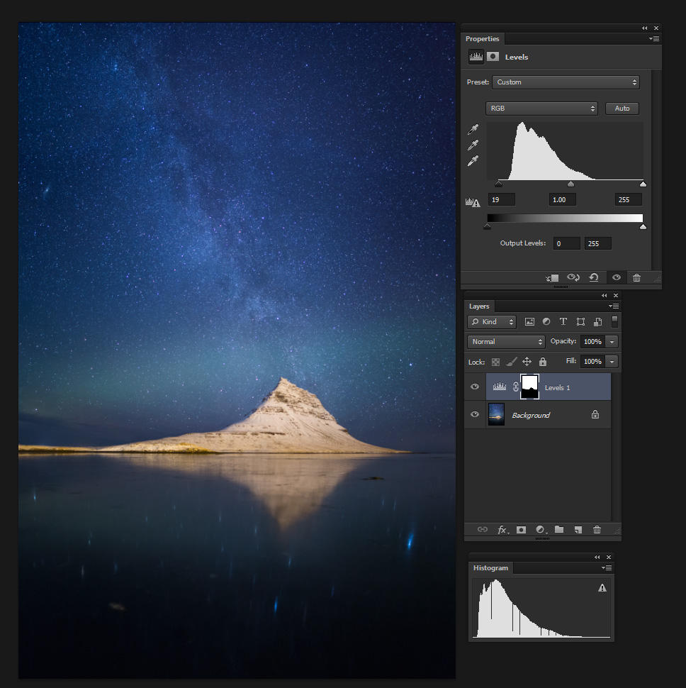
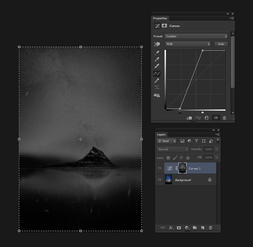
I started by applying some level adjustment on the selected sky area. As always, I used an adjustment layer.
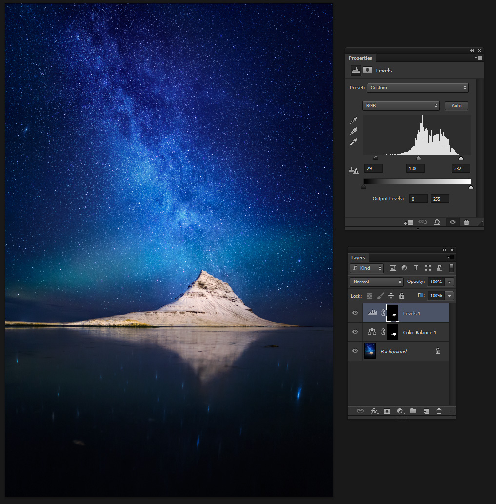
Next I needed to improve the contrast in the sky. The sensor has its limits and the sky I saw was much more defined than this! The contrast boost was achieved by using a curve adjustment limited to the mid-section of the histogram. I.e., I lightened the lights and darkened the darks, but only in pixels lying in the mid-range in terms of brightness. This way I could boost the contrast significantly without losing detail in the brighter or darker parts of the image.
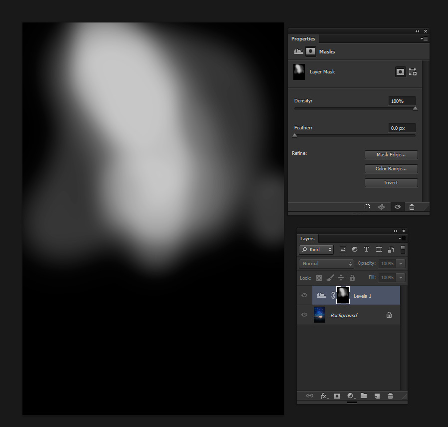
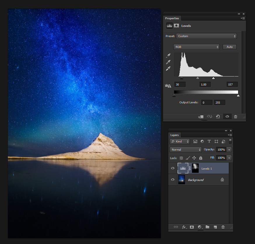
I've already explained some of the restrictive selection methods I use in my article 'Behind the Shot: Nautilus'. Please refer to it for an introduction. What's different here is that I chose the mid-range by saving a selection of the bright pixels as a channel, saving another selection of the dark pixels (achieved by performing the same procedure on the inverted image) as a channel, and finally subtracting (ctrl-alt-click on the channel mask) both selections from the full selection (what you get with 'select all' or ctrl-A), to obtain a selection restricted to the mid-range. I then applied quite a strong curves adjustment to boost the contrast in the sky area. After this adjustment, I further boosted the contrast in the sky by using a levels adjustment layer, and 'painting' it in. I'll show the process in the images below.
The next thing needing treatment is the mountain. It has quite a few problems, namely the terrible yellow color cast caused by the street lights in the adjacent road, and a lack of contrast. Let's see what I did here.

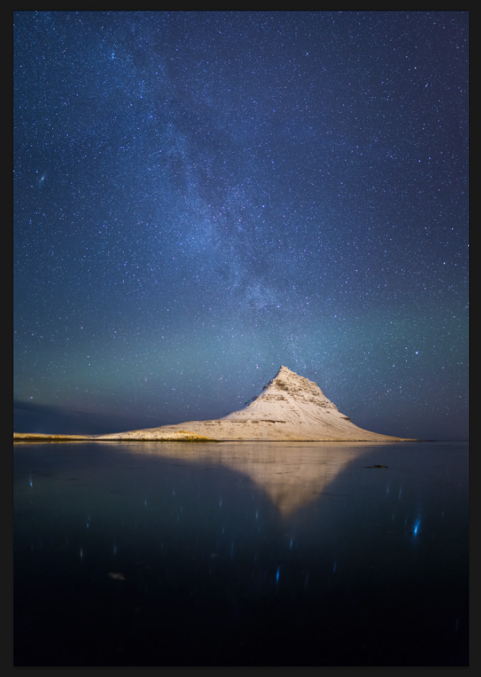
This was a tough image to create and process, but after all the hard work I think it looks good. To get it ready for Internet use, I converted the color profile to sRGB, reduced the size and performed some sharpening, and I was done!